As part of our COP3 proposals, we were asked to create a short, informal presentation, running over our ideas on what we want to do in COP3, and how we will research it over the summer.
Listening to all the other ideas within the presentations, as I was last, due to being cursed with a alphabetically lagging second name, my ideas evolved slightly from what's pictured within this presentation. As I will explain below.
I want to direct my work towards something relating to the 'first things first' manifesto, as my essay will encompass freudian methods of marketing towards men, and designing for the bad, designing for people to purchase things they don't need, with money they don't have, to impress people they don't care about. Rather than designing for something good, like a charity.
My idea is to apply the themes of consumerism, hidden persuasion and freudian methods to advertising, aimed at men, persuading them to spend on something good, rather than a commodity, in a nut shell.
Ant White
Design Context Blog
Archives
OUGD505: STUDIO BRIEF 2 - An Exhibition Of // 'Cosmetics' Branding Research
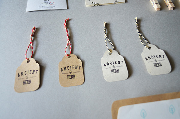
I've conducted some quick research to develop how some cosmetics, such as soap, body wash and shampoo might be branded. Developing an idea of how existing brands apply their design to their products, I can do this to my own, which I will then integrate with the brand guidelines.
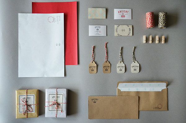
I'm looking into a collateral range, in which cosmetic products are features, and I will explore how they directly relate to other products within the branding.

The packaging using the colour schemes of the product throughout, in this case, the colours match that of the business cards.
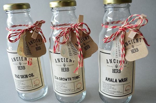
The bottles use a wrap around label which contain the same branding as the bar soap packaging.
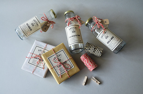
The products all work as a whole. The consistent colour schemes, especially on the labels helps the product represent the brand more, and using the red and white string to tie the brand further to the rest of the collateral
OUGD505: STUDIO BRIEF 2 - An Exhibition Of // Ticket Design Research
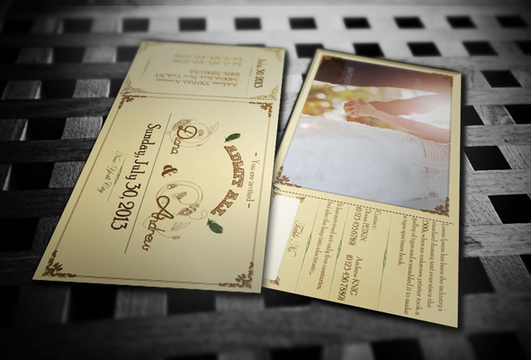
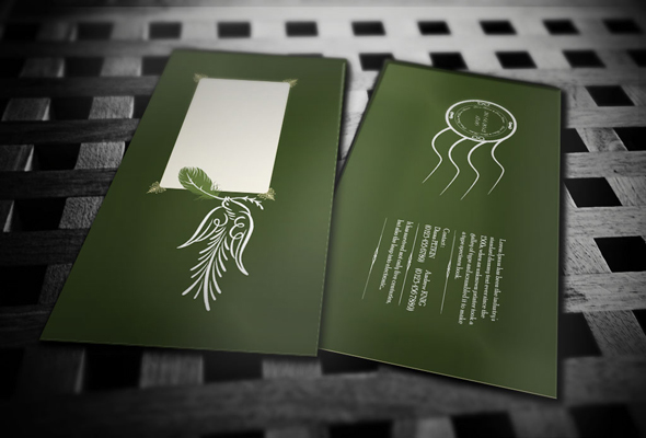
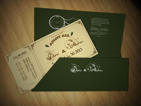
https://www.behance.net/gallery/9342071/Invitation-Ticket-Card
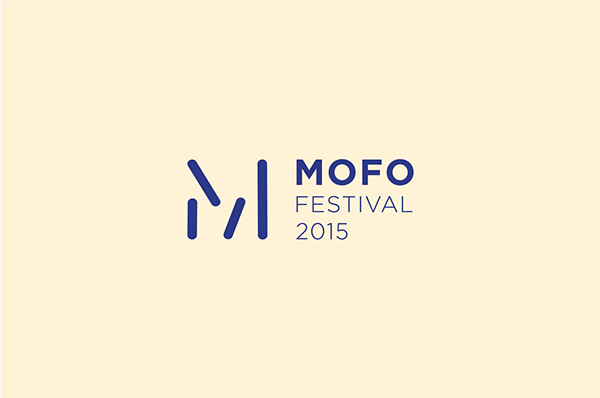
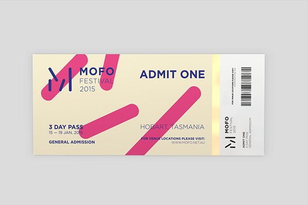

https://www.behance.net/gallery/16449141/MOFO-Festival


https://www.behance.net/gallery/9403189/Bright-Lights-Indie-Music-Festival


https://www.behance.net/gallery/10258375/Ticket-Design
OUGD501: STUDIO BRIEF 2 - Theory Into Practice // Final Product
I've created a product called Fertility, a piece of packaging designed to look like the majority of male fragrances on the market today. Using a limited amount of colours, and minimalistic packaging so the product 'stands on it's own'. Yeah.

Roman typography on the front of the packaging, to show it's traditional high class stature, reminiscent of type carved into marble, perhaps. With a gothic font underneath for the less important information. A developed system of hierarchy.

An outline image of the bottle inside the packaging, once again sporting the minimalist style throughout the packaging. To reflect the high class feel of the product, and the idea that it can stand on it's own, without elaborate packaging.


The Synthesis of my practical element
The packaging, ‘Fertility; Fragrance For Men’ is designed to interact with the male audience. Based on Sigmund Freud’s theory of human nature and consumerism. The idea that all humans have suppressed animal instincts, such as sexual desires, which have no place in society; therefore they are ‘repressed’. My critical written element discussed the theme of consumerism targeted at the male audience. Sexual objectification, celebrity endorsement and ‘model envy’ which are used to convince and tempt the male audience to buy a product. Hoping that that product will become a gateway to the transformation of the consumer, into the image they have painted of themselves, forged through the product endorsement - making them look better, like the celebrity endorsing the product, for example.
Within the packaging, there is a 6ml bottle of fragrance. Extremely small, with a little amount of product within. The packing is 200mm in height, and 70mm in width and depth. The packaging is far larger than the product, deceptive, a fabrication-metaphor the male sex organ; a penis extension. A glorification, an exaggeration, similar to how a large majority of me portray themselves due to the to expectations of society - to which purchasing enhancing products is the answer, through the themes and ideas of consumerism.
OUGD501: STUDIO BRIEF 1 - Critical Analysis // Final Essay
Final Essay, for submission. How has the effects of Consumerism affected design in the early C20th? Focusing on the advertising aimed at the male audience, how advertising taps into their instinctual desires.
OUGD502: STUDIO BRIEF 2 - Design Presence // Branding Initial Research
Before I begin to design my branding for this project, I want to get an idea of what some other companies have branded themselves as, how they have used their logos, and how they have applied a brand to a product.


I think the grid system the designer used to create this logo is wonderful. It allows for visual symmetry, within the logo, which in all results in a more aesthetically pleasing look, due to it's alignment.

The designer has also laid out the iconography along with the fonts for the branding. I think this a really interesting way to present some of the essential parts of the design, which might often be over looked.


https://www.behance.net/gallery/11572647/Lunch-Time-digital-branding


https://www.behance.net/gallery/13235799/Airmagine-Logo-Concept


https://www.behance.net/gallery/13381817/Atlantic-Identity-Redesign


https://www.behance.net/gallery/15862849/COSMIC-Personal-Branding
Subscribe to:
Posts (Atom)

Copyright 2010. All rights reserved.
RSS Feed. This blog is proudly powered by Blogger and uses Modern Clix, a theme by Rodrigo Galindez. Modern Clix blogger template by Introblogger.